
A. Context
B. The Tension
01 -
Problem
01
JEE buried inside everything else
When one app tries to serve every exam, no single aspirant is served well. JEE gets diluted into a general pool, and the student loses the focused path they actually came for.
02
Effort with no visible return
Students studied for hours and still could not say how much was done. Without a clear measure of progress, motivation leaks away and doubt fills the gap.
03
Anxiety with nothing to anchor it
No reliable way to test readiness meant the fear had no floor. The closer the exam, the louder the panic, because nothing on screen told them they were on track.
02 -
Research
A. The Process


B. Key Finding's
03 -
Approach
01
Focus on JEE, nothing else
No multi exam clutter. The entire app serves one aspirant with one goal. Focus was the feature, and everything outside JEE was cut on purpose.
02
Make progress impossible to miss
A progress dashboard sits at the center of the experience. Accuracy, completed chapters, strengths, weak spots, all visible at a glance. The student never has to wonder how far they have come.
03
Break the syllabus into decisions, not chaos
Chapter wise quiz structure replaces random question sets. The student chooses a specific area and works it, so preparation feels like a series of clear moves, not a scramble.
04
Rank by effort, not by fear
The leaderboard is built on XP earned through consistent practice, not raw scores. It shows relative progress without turning preparation into a source of exam anxiety.
05
Calm over decoration
Readable layouts, quiet interfaces, no visual noise. During long study hours, clarity is kindness. The design gets out of the way so the student can think.
04 -
Solution
01 -
Screen
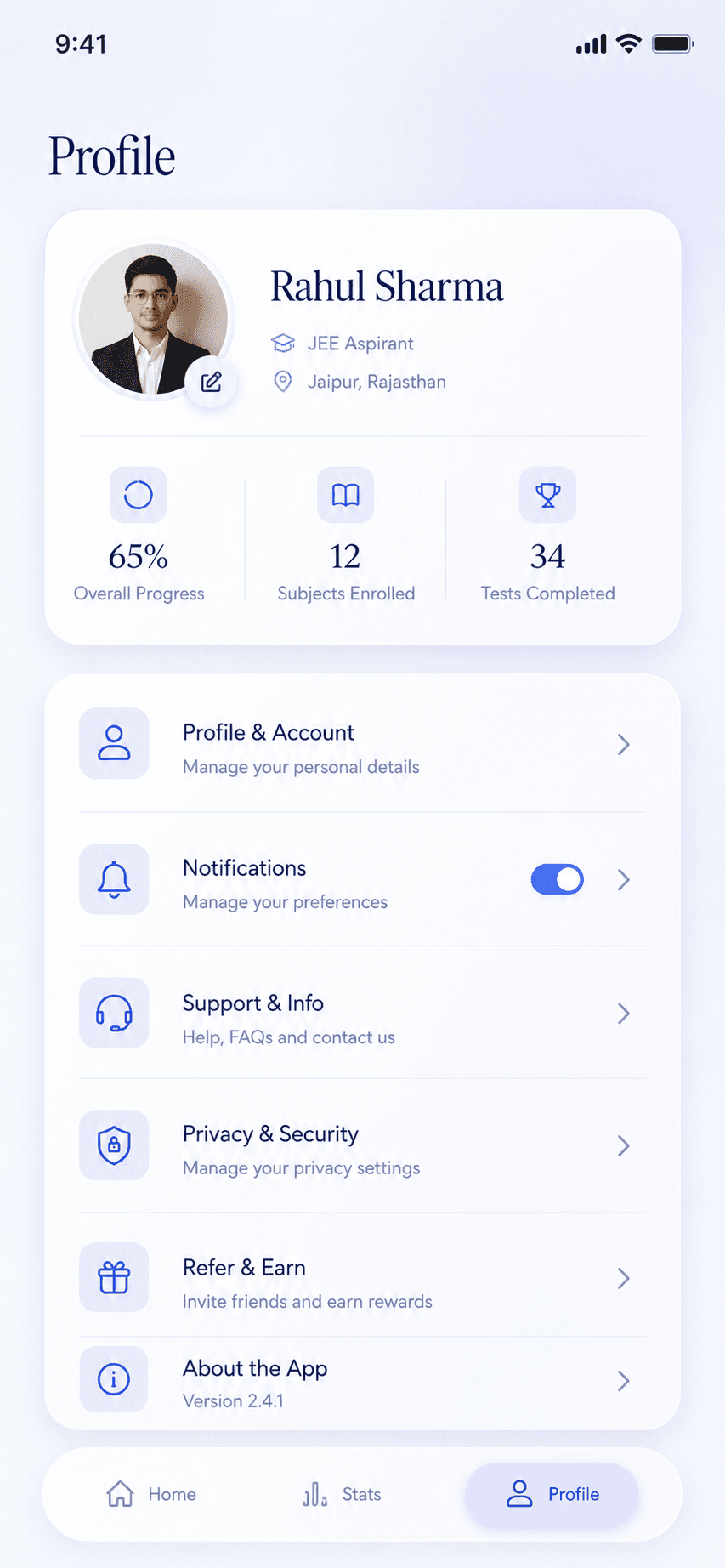
The heart of the app. Accuracy, strengths, completed chapters, and mistakes laid out in one view. It removes guesswork entirely. A student opens it and instantly knows what is working and what needs attention.


02 -
Screen
The syllabus broken into clear, focused pieces. Instead of navigating random question sets, the student picks a specific chapter and drills it. Preparation becomes a set of deliberate decisions, not a scramble.

03 -
Screen
Ranking built on XP earned through consistent practice, not raw scores. The student sees how they stack up without the pressure of exam style comparison. Motivation without anxiety.


03 -
Screen
Ranking built on XP earned through consistent practice, not raw scores. The student sees how they stack up without the pressure of exam style comparison. Motivation without anxiety.


05 -
Outcome
06 -
Retrospective
I would bring an AI based assistant into the core, something that reads a student's performance data and gives instant, specific guidance. The dashboard shows the truth. The next version should also tell the student what to do about it.
Balancing detailed analytics against a calm, simple interface was the constant tension. I chose clarity over completeness, holding back data on purpose so a student under pressure would never feel buried. Less on screen, more understood.
This project made one thing certain. Usability and calm matter more than decoration. A clear structure and a readable, quiet layout did more for an anxious student than any amount of visual polish ever could.